Monday, August 31, 2009

Start with a piece of blank paper and a pen

Image how children doodle on a piece of blank paper. Drawing lives since you sense that you are creating something. The fun spreads when the results are shown. It is also a time for sharing and responding. The essence of hand drawings lies in inviting people to see and share.

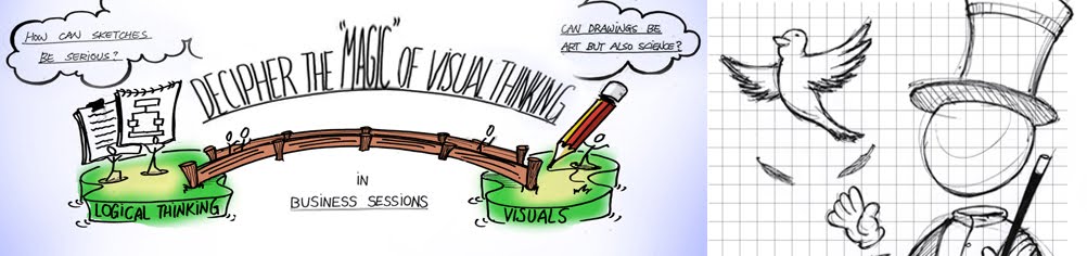
As an adult, we lose that ability to draw for different reasons. We are in pursuit of something more sophisticated to solve problems. We are so serious about producing solutions presented in neat computer graphics or a profound report. We ignore the truly sparkles of our wisdom which happened in the process. Visual Thinking/Graphic Facilitation (VT/GF) offers a way to help people reflect deep and respond openly in the process. If we want to duplicate the inspiring and evoking moments in the other sessions, we will have to find out how VT/GF triggers people being more creative and involved.

Nowadays, there are many terms in general using to describe what the graphic professional does when visually representing a group’s process. Some call “visual thinking”, “graphic facilitation”, “graphic recording”, and “graphic consultancy”. For the purpose of this study, the approach will be called Visual Thinking/Graphic Facilitation (VT/GF) in the fact that these two terms are mostly chosen by the facilitation companies internationally.

"Ongoing creation creates a living document" What makes Visual Thinking so special?(VI)

It is interesting to see other people drawing. That becomes simply a positive cycle in the process. People will be more and more curious about what will happen next. They will then be more eager to contribute when they feel more involved in the co-creation.

Visual thinker's/Graphic facilitators' work will be a big picture depicting not only the result of the team, but the process in the discussion. People can always get their "AHA!" moments back on the picture. The picture can be added on all the time when there is new idea. It can evolve with time and keep lasting effects after participants leave the workshop.

"Excellent Complex Problem Solver" What makes Visual Thinking so special?(V)


Contemporary business is complex, diverse and dynamic compared to decades ago. As the history of VT/GF described early on, VT/GF emerged when people need to solve problems involving expertise with diverse backgrounds. The creative process of solving novel problems is non-linear and even non-rational. Big paper offers scope in recording and communicating the flow of a meeting for a broader organization (Valenza, C. and Adkins, J., 2009).

In front of the participants, Visual Thinkers/Graphic Facilitators spread out all of the “elements” reflected from the verbal and nonverbal information. People can simply make a good use of their innate visual abilities (section 2.2) to browse through the sea of information in graphics, and find out relevant points and coherence which make meanings to them. This is what we do every day to predict the surrounding factors, and Visual Thinkers/Graphic Facilitators simply take advantages of the natural talent for people to thread through rather complex issues in a group level phenomenon.

The emphasis lies on creating design documents that can be understood by people from different backgrounds, and that provide a visual overview so that important factors are not lost in lines of words (Stapper P. et al., 2005). Compared to VT/GF, vocalized ideas are merely bits of vibrating air. Visual thinkers catch elusive information, record them on the paper and make them accessible as drawings. People then can always build on each other's work or opinions without losing any positive details. It can involve wider groups of stakeholders in the process of creating fresh decisions (Valenza, C. and Adkins, J., 2009).

Sunday, August 30, 2009

The Gestalt laws of perceptual organization


In 1912, Wertheimer, Kurt Koffka and Ivo Kohler questioned sensations theory were not enough to explain the entire perceptive phenomenon (Goldstein, EB., 2001). One of the basic principles of Gestalt psychology they demonstrated is “The whole is different than the sum of its parts.” The laws of perceptual organization are a series of rules that specify how we organize small parts into wholes by vision.

"Crappy V.S Beautiful -- Different Roles of Drawings" What makes Visual Thinking so special?(IV)

There are different levels of drawings used in VT/GF. A given drawing has the ability to represent something really simple and something really complex. Visual Thinkers/Graphic Facilitators take advantages of the flexibility of drawings. In the process, they draw images and texts with open interpretation for simulating creative thinking. For the result, they choose a metaphor which contents correct and rich information deriving from participants' shared understandings.

A rough drawing could be also very meaningful since it makes sense in the discussion. However, a beautiful drawing done after workshops could be meaningless if it loses the links to the context. It is important to differentiate the functions of the drawings in the process and after sessions.

On one hand, the drawings in the process do not have to be sophisticated compared to the final mutual result. They are more like a real-time reflection (Valenza, C. and Adkins, J., 2009) of the process of meeting, which is beneficial to build TMMs. On the other hand, the refined drawings after sessions need to be profound enough to breed post-meeting ideas instead of only a reflector. A proper transformation (Stapper P. et al., 2005) helps people contemplate thoroughly with a coherent picture. However, the refined work is time-consuming (Valenza, C. and Adkins, J., 2009) and risky to lose underlying association of the drawings crating in the process.

"Different Roles of Players in the Process and Result of a Session." What makes Visual Thinking so special?(III)

The picture above is about what participants and Visual Thinkers/Graphic Facilitators in a workshop will focus on in terms of "process" and "result". This picture above differentiates different expectations and purposes of participants and Visual Thinkers/Graphic Facilitators.

In top-right fan, participants always focus more on a promising result while, in bottom-left fan, Visual Thinkers’/Graphic Facilitators’ first priority is to build a sense-making process for participants.

In terms of the result in sessions, the top-left fan indicates that participants are beneficial to sense-making in the process. Finally, Visual Thinkers/Graphic Facilitators help to reach the result by building mutual sense-making in bottom-right fan.

We can conclude that Visual Thinkers/Graphic Facilitators need to alter their focus and skills in different phases in group sessions in order to assist participants’ expectations. They should be sensitive to participants’ demands and weakness in every phase, and keep on supporting them.

Wednesday, August 12, 2009

"3-30-300" and "AIDA" Principles in Composing a Successful Infographic

Infographics, to me, is an important tool to build a sturdy bridge among researchers, designers, and also the stakeholders who do not share the same backgrounds knowledge with you.

Here is an example that I did in a research project on Town Watchers, or Wijkagent in Dutch. They are one kind of policemen, and their missions are mainly focused on how to prevent crime in communities instead of punishing crime like normal policemen. We presented the results of our findings in the research as an infographic.

In this infographic, we applied the "3-30-300" principle which indicates that, in first 3 seconds, readers can get immediately what this poster is about, in the following 30 seconds, they can know better by browsing through some subtitles or graphics, and, in the lasting 300 seconds, they can continue exploring the background knowledge with the detailed explanation. This idea could be demonstrated as the picture below.

We also apply the "AIDA" principle, which refers to Attraction, Interest, Desire, and Action. Attraction is to catch the attention of the reader. Interest is to appeal them with the topic or content. Desire is to make them eager to learn. Action is to ensure that the desire to learn is translated into actual learning.

In the first 3 seconds, we used the main metaphor, an elephant, to represent Town Watcher's compassionate personality and down-to-earth endeavor. We made it as a eye-catching item to attract people's attention and arouse people's interests in it. After their desire to learn more was triggered, n the following 30 seconds, readers can browsing through the various attributes around the elephant, such as a compassionate heart, a huge brain, and a back carrying responsibility. Then, in the lasting 300 seconds, they can learn more about the Town Watchers' daily life by reading the supporting articles and graphics surrounding the poster. The supporting materials ensure that the poster can be frequently revisited and stay fresh, informative, and inspiring.

However,
an eye-catching drawing is not a guarantee to be a successful infographic. A well-made infographic must be coherent in these three levels. It is crucial to make sure there are enough clues and linkages among these three levels. So the reader will not be puzzled by the overwhelming data but always can find a way to go on. Only under a thorough, organized design process, the poster then can really attract people in the first sight and keep them been informed and inspired for a long time.

Some Great Infographic Examples

What is Infographic?
"Information graphics or infographics are visual representations of information, data or knowledge. These graphics are used where complex information needs to be explained quickly and clearly, such as in signs, maps, journalism, technical writing, and education. They are also used extensively as tools by computer scientists, mathematicians, and statisticians to ease the process of developing and communicating conceptual information." _ (Source: Wikipedia)

Here I selected some great examples of Infographics:

(Picture above, Source: XPLANE-examples, Copyright xplane.com)

(Picture above, Source: Transparency: The Largest Bankruptcies in History)

(Picture above, Source: Inside Dylan's Brain)

(Picture above, Source: Infografía premiada en los 2Q/NAO 2007)

(Picture above, Source: What's In Your Mail?)

(Picture above, Source: Lance's Last Tour, the graphic and design was done by Michael Mode and Steve Cowden, the text is by Bonnie DeSimone and James Yu. )

More examples in 50 Great Examples of Inforgraphic, Cool Infographics, BRAVO!

Monday, August 10, 2009

"Speed Up by Slowing Down First." What makes Visual Thinking so special? (II)

The process of Visual Thinking is just like a sequence of thinking loops. People can keep cycling in a loop or move back or forth between loops. Visual thinkers use multiple techniques to help the thinking flow smooth in the session. People can think more fluid and, instead of being rushed into next loop, slow down their thinking. People can therefore stay in a thinking loop longer until they get enough insights.

Paradoxically, people become more efficient in a rather complex and unpredictable task because of slower thinking process. The slower thinking process allows them think deeper, cohere each other, and then build a more profound Team Mental Model. This TMM will result in better performance, better predictability of errors in an uncertain context, and cooperative decision making. People, therefore, can focus on what really matters and waste less time in trial and error. Totally, the slower thinking process actually makes the whole process in a rather efficient fashion.

"Imperfect Strokes Makes Hand Drawings Human and Touchable." What makes Visual Thinking so special?(I)

In the book, "the Back of the Napkin", Dan Roam (2008, p.25) pointed out that the spontaneity and roughness of hand-drawn pictures make them less intimidating and more inviting. Visual thinking is not about how polished our presentations are, but it is in how comfortable we are in thinking with our eyes. Therefore, audiences respond better to hand-drawn images (however crudely drawn) than to polished graphics. People then feel like working in a common ground and do not worry about offering up half-formed ideas for consideration.

3 Ways How Visualization Help Persuading in Ad

Different drawings or pictures can represent different implications to the readers. So, we can use these properties of drawings to convey "right" information to "right" readers. In his book, ‘Visual persuasion’, Paul Messaris (1997) explores how images help advertisers to bring their points across. He described the images with three properties:

1. “Iconicity”, referring to the quality of a visual representation of sharing qualities with the object it refers to, such as a scale model of an airplane.

2. “Indexicality”, referring to the quality of a visual representation of being caused by the object and serves as a physical trace pointing to the object’s existence, such as footprints on the beach which indicates the earlier activities.

3. “Indeterminacy”, meaning that visual representations can often be interpreted in various ways. For example, in cigarette commercials, the relationship between smoking and a healthy outdoor lifestyle is often implied, but not expressed straightforwardly. The images here leave space for imagination with very little detail.